This Suggestion has been reviewed by our staff and has been implemented
Suggestion
Warning Popup When Data Entered Incorrectly
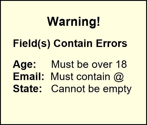
The current method of warning people that they've incorrectly entered field data is far from satisfactory. It's too easy to miss the Explanation Mark in a red blob, especially on smaller screens. A far better way of warning people is to have a popup which lists the errors. How it's implemented and what it looks like is something for the developer to decide, but I liked the message used on Wickle (now defunct) which is similar to the example below.
Photos
Warning Popup When Data Entered Incorrectly

Comments
Order by:
Per page:
Geek_Girl: Yes, my users have often complained of the little red circles things as well.05.08.2020 0 points
Info
Rate
Recommend


