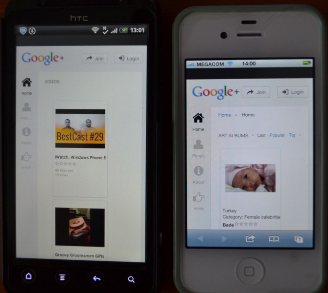
Here's what a few of those so-called responsive templates look like on my iPhone:
(This one will set you back 165 bucks)
 Here's what a few of those so-called responsive templates look like on my iPhone:
(This one will set you back 165 bucks)
My opinions expressed on this site, in no way represent those of Boonex or Boonex employees. |
Somebody explain to me exactly how you can call these responsive, and what the point of rearranging the page layout according to browser window size is. My opinions expressed on this site, in no way represent those of Boonex or Boonex employees. |
so-called responsive templates
Yeah I agree... some of the responsive templates are not good. I wish that there were deveolpers getting up here and come up with real cool designs. But don't forget the whole dolphin base should be redesigned to make it more inline with responsive templates and smartphone layout. So I think that the Boonex team should get there ass moving too. Now people will leave due to the fact that it all looks lil old and has style(layout) of 2000 instead of 2014. |
There is a new vendor offering free responsive templates as part of a beta... I downloaded and am testng. Would love additional feedback on these templates. I'm testing on baldmen.com Thanks! Peer Peer L. Plaut Executive Director, Single Booklovers Connecting Bookworms Since 1970 |
BSETec's templates are some of the best and the responsiveness is awesome! DedicatedServer4You.com -- BIGGEST Range of Dedicated Servers at the Lowest Price! |
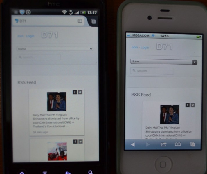
RE BSETec's templates are some of the best and the responsiveness is awesome! So this is what you are all excited about? What the bsetec "responsive" template on the author's own website, looks like on my iPhone My opinions expressed on this site, in no way represent those of Boonex or Boonex employees. |
I have that template ... it needs some work but it's a great template ... so are his other templates! Look great on all screens just about. DedicatedServer4You.com -- BIGGEST Range of Dedicated Servers at the Lowest Price! |
Palcom template is very good and Hope4Life template also pretty neat ... DedicatedServer4You.com -- BIGGEST Range of Dedicated Servers at the Lowest Price! |
My sites don't look like that on different screen sizes ... ! They break down more to actually the blocks etc within screen. I do think the template needs more work though, it's not perfected yet.
RE BSETec's templates are some of the best and the responsiveness is awesome! So this is what you are all excited about? What the bsetec "responsive" template on the author's own website, looks like on my iPhone
DedicatedServer4You.com -- BIGGEST Range of Dedicated Servers at the Lowest Price! |
I think HL iPhone is really messed up Note: Not saying all templates are the best. so much to do.... |
So, I tried their template converter product on singlebooklovers.com test site. Dolphin Jay is in the process of migrating to production. It's not perfect. I'm hoping Dolphin Jay can tweak our template to work as well as the template on baldme.com. I sent them a note saying I was happy to purchase a template when out of beta. Peer L. Plaut Executive Director, Single Booklovers Connecting Bookworms Since 1970 |
Detective.. I plan on using Palcom template on old baldhippie.com. Still bringing this one together.. :) Peer L. Plaut Executive Director, Single Booklovers Connecting Bookworms Since 1970 |
RE: I think HL iPhone is really messed up Note: Not saying all templates are the best. Perhaps it is, but then so are the other 300 million iPhone 4s out there. My opinions expressed on this site, in no way represent those of Boonex or Boonex employees. |
Perhaps it is, but then so are the other 300 million iPhone 4s out there.
did you tried some other browsers on your phone? Cuz i doubt your iphone browser is adjusting the viewport of the website to its screen width. or this could be tried, cuz your browser might be zooming out to fit the content <meta name="viewport" content="width=device-width, initial-scale=1" />
so much to do.... |
RE: or this could be tried, cuz your browser might be zooming out to fit the content <meta name="viewport" content="width=device-width, initial-scale=1" />
So what should I do? Hack into the guys website and add that to the header?
P.S. Please don't say "cuz" anymore. My opinions expressed on this site, in no way represent those of Boonex or Boonex employees. |
For me - any responsive template I used adds extra space to the right. So, to resolve this, I set my page widths at 80% (using Deano's Tools). This allowed everything to expand to 100% when viewing with a mobile device. caredesign.net |
I have purchased 2 responsive templates, one from AndrewP, the other from MasterTheme. Both are excellent and work perfectly well on iphone 4, not at all like the display Houston is getting... not sure whats going on with that! I did try some of the free ones, but found they needed quite a bit of refining work still so went with the ones that are paid for and get great support also.
I have lots of websites I work on, some are responsive, some have separate mobile versions, and I have to say, these 2 template I have are as good as any specific mobile template. You wouldn't know the difference. They do require a little extra thought in page layout, as you have to account for what is going to be moved where on a smaller screen even when designing layout for a larger screen. If you can get your head round that, then you save a lot of time only have to use a single template for all devices.
Sometimes you get what you pay for I guess! Free doesn't always mean great. |
My bad - just seen Houston's example cost 165...! I would be having words with the seller in that case. |
I noticed on the market demo link for the G+ theme you're looking at, the 'responsive' feature has been added to the template at a later date. Maybe the demo link has not been updated as it doesnt show as responsive on my iphone either. One of his other themes (neo) is responsive on iphone and is excellent. Will contact AndrewP to check. |
RE My bad - just seen Houston's example cost 165...! I would be having words with the seller in that case. I haven't bought any of these...that's not the point. If these are supposed to look different than the screen shots I posted, then I have no idea what it should look like. Can you post a screen shot? My opinions expressed on this site, in no way represent those of Boonex or Boonex employees. |
Will post one up of the Neo template, and another from the Hypernova template both that I use. Just on the way out to a meeting at the mo so will do when I get back. Both look as you would expect a responsive template to look. |
Hi Joe, Yes, the responsive design means that it looks good at most (nearly all) mobile devices (in mobile browsers. With regards to my G+ theme, the demo website was not updated, I've just updated it. And I also photographed both my phones (android and iphone) with this theme
|
The Neo theme looks like:
|
The G+ template is better now, however the more link doesn't work on my iPhone 4 (OS v 4.3.2) Safari browser. Also, when you scroll down the page to get to the bottom of the content, it sure is a lot of scrolling just to get back up to the main navigation menu. Maybe the main nav menu should have position fixed. My opinions expressed on this site, in no way represent those of Boonex or Boonex employees. |
Another thing that is an issue, is dbTopMenu's with a lot of items. The tiny little arrows that scroll the menu horizontally, will never be noticed by the user. Boonex should have made these a selector element.... that way the dbTopMenu would be usable on small screens. My opinions expressed on this site, in no way represent those of Boonex or Boonex employees. |
Boonex should have made these a selector element.... that way the dbTopMenu would be usable on small screens.
That is one thing that they should have done from the beginning!! |
So far, every responsive template demo I've looked at, crashes my browser on a screen rotate... almost exclusively when rotating from landscape to portrait. My opinions expressed on this site, in no way represent those of Boonex or Boonex employees. |
I have the Nanbargal Community template and on iphone 5 and it looks good. (also on rotate screen) |
Thats odd, checked on my iphone4 rotating screen on Neo and Hypernova templates and is fine on both. Am using 6.1.3 and safari So far, every responsive template demo I've looked at, crashes my browser on a screen rotate... almost exclusively when rotating from landscape to portrait.
|
The G+ template is better now, however the more link doesn't work on my iPhone 4 (OS v 4.3.2) Safari browser. Also, when you scroll down the page to get to the bottom of the content, it sure is a lot of scrolling just to get back up to the main navigation menu. Maybe the main nav menu should have position fixed.
Any iPhone... Chrome, Opera Coast, Safari, etc.... just tap on the very top bar (time, carrier, battery, etc). It will take you to top of the page instead of scrolling back to top. Android will have to scroll, good way to go is to add 'scroll to top' button.
G+ theme, 'More' in Menu has issues. Cut-off after Video in portrait. Also cut-off after 'About' in Menu in landscape. |
RE: Thats odd, checked on my iphone4 rotating screen on Neo and Hypernova templates and is fine on both. Am using 6.1.3 and safari It could be because I stayed with a V4 OS, but I have no intention of installing a bigger OS designed for faster phones. Believe it or not, I use my iPhone primarily as a phone, and because of that, there are no advantages provided by an upgrade. However, there are probably somewhere around 300 million iPhone 4s in use, and I'd expect many of the to still be running a V4 OS, considering what a pain in the ass is is to upgrade it to V5. I don't know why these templates crash the browser on a screen rotate, but it happens pretty consistently, and mine is a standard issue iPhone. I have no idea how a person would even go about troubleshooting something like this, I guess I'll do some digging to see if it's any sort of known issue. My opinions expressed on this site, in no way represent those of Boonex or Boonex employees. |
iphone4 rotating screen lock / crash
just a quick search on this gave me a huge result. So you are not alone i guess... So i think that it has more to do with the phone then the template. |
RE: Any iPhone... Chrome, Opera Coast, Safari, etc.... just tap on the very top bar (time, carrier, battery, etc)
Well... damned if it don't. Never knew that before. That shows you how little I have used my iPhone for web surfing in the last 5 years. My opinions expressed on this site, in no way represent those of Boonex or Boonex employees. |
RE: So i think that it has more to do with the phone then the template.
At least it is something iPhone web surfers are used to. My opinions expressed on this site, in no way represent those of Boonex or Boonex employees. |
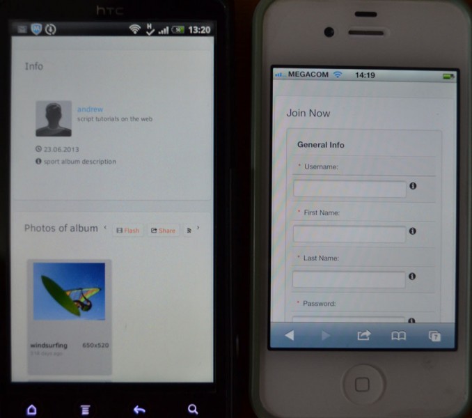
RE: I have the Nanbargal Community template and on iphone 5 and it looks good. (also on rotate screen) You must be seeing something different than what I am seeing. This is what this template looks like on my iPhone 4 Can you, or anyone else post a screen shot of what this is supposed to look like? My opinions expressed on this site, in no way represent those of Boonex or Boonex employees. |
HL, i think it's to do with the way they have the demo link set up that makes it not work properly on your phone, i've just tried this link: http://bsetec.com/demo/dolphin_preimum/index.php?skin=nanbargal-community it looks like it should (i.e. responsive) on my iphone 4 |
RE: HL, i think it's to do with the way they have the demo link set up that makes it not work properly on your phone, i've just tried this link: http://bsetec.com/demo/dolphin_preimum/index.php?skin=nanbargal-community it looks like it should (i.e. responsive) on my iphone 4 That link works better. Lots of room for improvement though.... especially with the outline. My opinions expressed on this site, in no way represent those of Boonex or Boonex employees. |
I use bsetec. They said they were going to update their code to bootstrap 3 for all their templates within a few weeks. |
Is there a mobile version for the admin panel? Nobody wants to use a PC or Mac anymore... Peer Peer L. Plaut Executive Director, Single Booklovers Connecting Bookworms Since 1970 |
I am having the best luck with bstec as well. I did find a flaw on the join page where if birthday as a mandatory field, you could not enter your birthday from a drop down calendar. They are looking into this for me. Peer Peer L. Plaut Executive Director, Single Booklovers Connecting Bookworms Since 1970 |
I use bsetec. They said they were going to update their code to bootstrap 3 for all their templates within a few weeks.
Few weeks? I already update bootstrap 3.1.1 three months ago with no problem. |
I am having the best luck with bstec as well. I did find a flaw on the join page where if birthday as a mandatory field, you could not enter your birthday from a drop down calendar. They are looking into this for me. Peer
I ran into that problem long time ago. Issue is same colour with font and background... made it appear "empty". You need to either change the colour of background or font to make it appear. |
Shouldn't bstec make the fix? lol P. Peer L. Plaut Executive Director, Single Booklovers Connecting Bookworms Since 1970 |
Is there a good mobile app to manage the admin side from a mobile? P. Peer L. Plaut Executive Director, Single Booklovers Connecting Bookworms Since 1970 |
I already update bootstrap 3.1.1 three months ago with no problem.
I have the nanbargal-community template and i want to update the bootstrap to 3.1.1 How can I do this myself as I don't wanna wait on bsetec. |
many responsive template look bad on different screen sizes |