I have a problem with displaying my website www.areavis.com on different screens.
Now I have a template responsive. On my wide screen, it works fine. But on smaller screens (and not only) look quite different, the background is too white, fonts are different ...
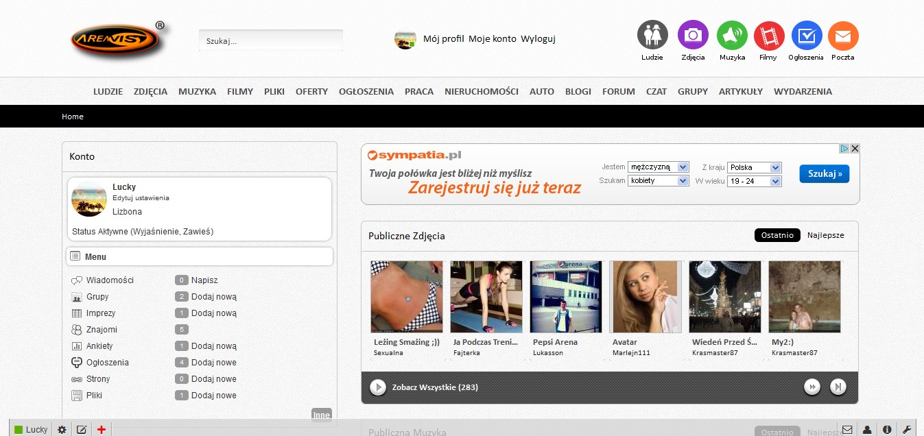
Please take a look how looks on my wide screen:
And how looks on different screen:
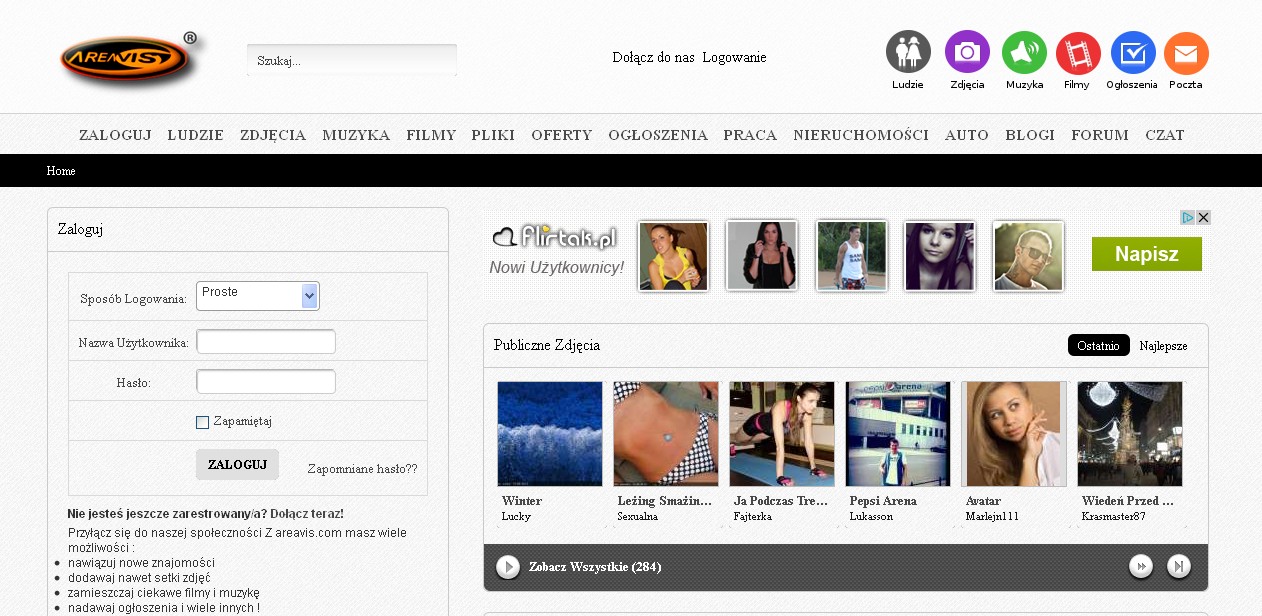
Please help, I would like to the other screens website looked like on my wide.
|
Are these screen shots done on the same computer with the same Browser? Geeks, making the world a better place |
Are these screen shots done on the same computer with the same Browser?
Only the same browser. But different computers.
|
Is Calibri not installed on the other computer, by chance? I can't find a webfont for it on your site. BoonEx Certified Host: Zarconia.net - Fully Supported Shared and Dedicated for Dolphin |
I believe Nathan nailed it. Your using a non standard font that the other computer most likely does not have installed.
Also keep in mind that every computer monitor will also display colors differently. The brightness and contrast of colors from one computer to another will be slightly different unless you go the the trouble to properly calibrate the monitor.
https://www.deanbassett.com |
What you can do is to specify a font family that is standard on most computers. Keep in mind that some fonts that are standard on windows installations may not be standard on a Mac. You can search the internet for a list of fonts that are standard on both Windows and Mac; and maybe even on Linux as well. Geeks, making the world a better place |
Probably not. As for the other screen bad displays. But on my wide screen is Kalibri and displays well. But how to install a webfont on my site?
Is Calibri not installed on the other computer, by chance? I can't find a webfont for it on your site.
|
In that case, what is the most universal font for all screens? I wish on every screen website look the same.
This is true. I noticed that I was doing a screen shot on the small screen. Watching screenshot on your wide screen brightness and colors is no different.
I believe Nathan nailed it. Your using a non standard font that the other computer most likely does not have installed.
Also keep in mind that every computer monitor will also display colors differently. The brightness and contrast of colors from one computer to another will be slightly different unless you go the the trouble to properly calibrate the monitor.
|
That this should be the best in this situation. Thank you for the advice. And what do you think is the greatest font type operating on all screens?
What you can do is to specify a font family that is standard on most computers. Keep in mind that some fonts that are standard on windows installations may not be standard on a Mac. You can search the internet for a list of fonts that are standard on both Windows and Mac; and maybe even on Linux as well.
|
responsive template will also display differently on different screens/pcs if they have different screen resolution.
aside of the font issue being discussed...!
|
responsive template will also display differently on different screens/pcs if they have different screen resolution.
aside of the font issue being discussed...!
100% right... that's why they are called responsive.
ManOfTeal.COM a Proud UNA site, six years running strong! |
Thank you. Yes you are right, were discussed. But when I add this this on the forum I didn`t know that it will about fonts issue.
responsive template will also display differently on different screens/pcs if they have different screen resolution.
aside of the font issue being discussed...!
|
https://www.deanbassett.com |
Thank you ! I changed the font to Arial, because it is the most popular. Maybe this will help.
|
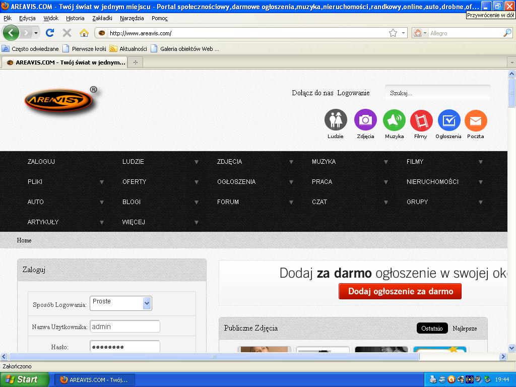
Today I tested the next screen. Normal computer screen (not the laptop screen)
As I written my template is responsive. My website lacks stability when it comes to appearance. Please take a look how looks on some computer screen:
 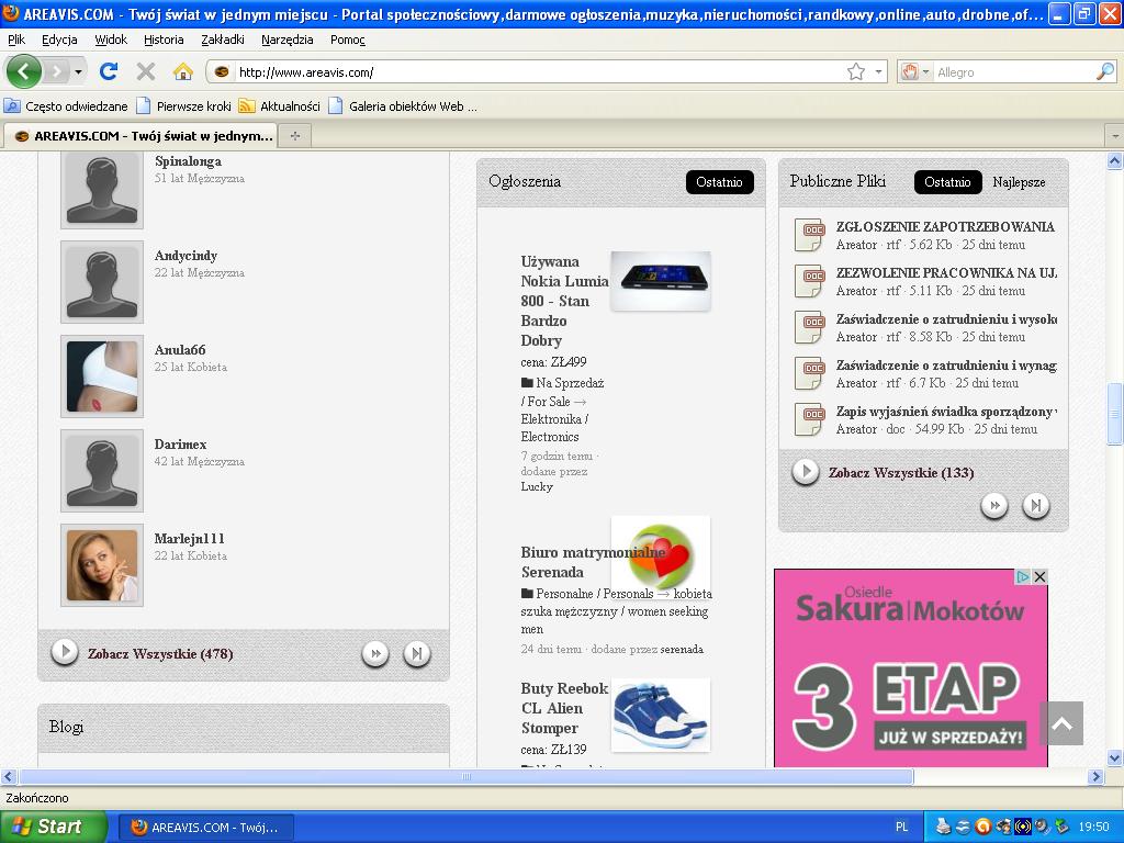
how to set the default appearance for these screens? I wish for each screens display a website the same.
1.JPG · 144.7K · 299 views 2.jpg · 135.2K · 288 views |

